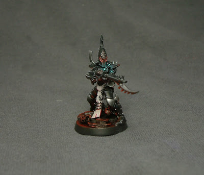
Muh hahaha ha haaagh liive ! LIIIVE my pretties, release the
I actually like this test scheme, I think I'm good to go.
This turned into a heck of alot of work, going to have to find a way to speed this up when I do the army. I really like how the basing turned out and will have mangled skeletons and jagged rocks all over the place , I'm kinda Impatient to see what the red uplight looks like on a raider .....And I'm really going to need a way to speed these up, Its a little less monochrome than I had originally planned but needed the extra colour to make it 'pop'
I even tried something new with the photography, better ? or stick to white ?
Steve, if you read this , drop me a line , I need to bounce some ideas off you for my Archon Conversion ;o)
Does this work as DE ? I think it does ?
lastly a small update, Next rave review is Grotesques, should go up over the course of the weekend, spacewolf showcase on El D's blog is also on the cards and fingers crossed , we have a cracking Interview lined up. As for painting Ima crack on with finishing the mechdar while I convert my Archon , he will be my reward for finishing all the tanks ....
Soon


Stunning again, an an exceptional base, will that be used on the whoe army? and glad to know the Mechdar are still getting painted.
ReplyDeleteOh and i like the new gray backdrop.
The best one yet, definitly keep that as your colour scheme. Cant wait to see what a unit/army looks like all done with it. The base really sets off the model and the slight red uplight gives them quite a menacing glow.
ReplyDeleteIm not a photography expert, but i think the grey is better than the white, it doesnt bleed as the colour as much.
Cool lighting effects and the base really is the bee's shattered knees (particularly if you do a battle board to match). I'd need to see a contrasting image of a figure on the grey and white backdrops - however, I think that the white one looks more "professional" - the grey one is possibly a better background for your colours, but it does look a bit like you've used an old pair of jeans - such thinks may be okay for my paint jobs and projects, but your work deserves a better setting.
ReplyDeleteWe have a winner!!! I love the OSL. Keep on painting and with the holiday coming up.....there will be extra time!!!
ReplyDeleteHey guys thanks for the feedback, makes it worthwhile when others enjoy the fruits of my self-torture.
ReplyDeleteI had ones with white , but the colours were more washed out , think ima stick to frey from now on , this was just a test using a grey t shirt in my usual homade light box.
"the bees shattered knees" lol cheers :o)
May I suggest that you crop your pictures before upping them? As for the colorsheme: approved
ReplyDeleteLol, they are cropped :oP I dont like a claustrophobic box around a mini, however I'll have to agree this time, perhaps they could have been cropped a little more.
ReplyDeleteIm' glad you: approve, can see you are going to be hard to please ;o)
Welcome aboard
That is a great color scheme.
ReplyDeleteVery clean paint job, gratz
ReplyDeletevery nice man, I'm working out a scheme as well
ReplyDeleteGlad you like , and welcome aboard the E train .... Please link me when you have something up, always interested to see others work :o)
ReplyDeleteFeel free to steal Either of my two failed schemes......